Deprecated: Using null as an array offset is deprecated, use an empty string instead in /home/pa-syco/public_html/runebrush/wp-includes/class-wp-block-type-registry.php on line 168
Deprecated: Using null as an array offset is deprecated, use an empty string instead in /home/pa-syco/public_html/runebrush/wp-includes/class-wp-block-type-registry.php on line 168
Deprecated: Using null as an array offset is deprecated, use an empty string instead in /home/pa-syco/public_html/runebrush/wp-includes/class-wp-block-type-registry.php on line 168
Deprecated: Using null as an array offset is deprecated, use an empty string instead in /home/pa-syco/public_html/runebrush/wp-includes/class-wp-block-type-registry.php on line 168
Deprecated: Using null as an array offset is deprecated, use an empty string instead in /home/pa-syco/public_html/runebrush/wp-includes/class-wp-block.php on line 257
Deprecated: Using null as an array offset is deprecated, use an empty string instead in /home/pa-syco/public_html/runebrush/wp-includes/class-wp-block-type-registry.php on line 168
Deprecated: Using null as an array offset is deprecated, use an empty string instead in /home/pa-syco/public_html/runebrush/wp-includes/class-wp-block-type-registry.php on line 168
Deprecated: Using null as an array offset is deprecated, use an empty string instead in /home/pa-syco/public_html/runebrush/wp-includes/class-wp-block-type-registry.php on line 168
Deprecated: Using null as an array offset is deprecated, use an empty string instead in /home/pa-syco/public_html/runebrush/wp-includes/class-wp-block-type-registry.php on line 168
Deprecated: Using null as an array offset is deprecated, use an empty string instead in /home/pa-syco/public_html/runebrush/wp-includes/class-wp-block-type-registry.php on line 168
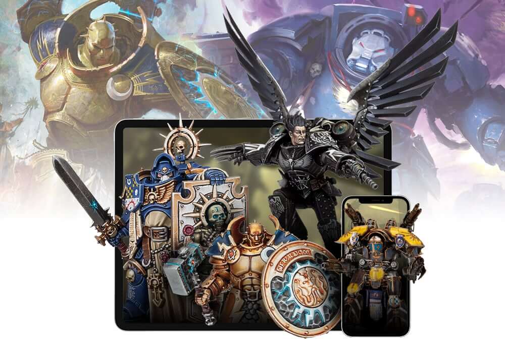
Yesterday Games Workshop revealed a brand new website, in this post I put on my day job hat and review what they’ve given us.
I try not to cross the streams of work and hobby too often, but having worked at my present company as a senior web developer for almost a decade running a decent sized ecommerce website (around 40% the online turnover of GW’s), I have the position of being fairly well suited to give both a technical and personal view on the new warhammer.com website (or at least I feel I do).
One of the first things I’m going to say is that none of my comments are meant personally – I don’t know the people involved in creating the new website or making the decisions. I also except that compromises are constantly needed to achieve timescale goals. Instead, I’m looking at this from the angle of items that I would have done differently with my 20 or so years experience in website creation in one form or another.
Unusually, rather than a refresh, we’ve got a brand new website that’s been designed from the ground up which incorporates both the old games-workshop.com and forgeworld.com websites. The general rule of thumb is that a website should ideally be refreshed in some way every three to five years, but it’s very unusual to have both a ground up refresh and domain change. I suspect the reasons for this may be related to the new WMS that has been implemented recently. One things we don’t know is if this was built in house or contracted out to a third party – I expect it’s been contracted out which is what happened for the previous version.
Doing something like this from the ground up poses great possibilities with greater requirements. Firstly you have an open book, things that were technically not possible previously suddenly are, however you need to recreate all of the bespoke elements and connection between the website and WMS likely from scratch.
First and foremost when creating any website is you need to work out the primary function of the site is going to be. Every decision made should be weighed against this primary function, to coin a saying “does it make the boat go faster” – anything that impedes that primary function should be discarded. As some simple examples, this blog’s primary function is to allow me to create hobby content for people to read and the BBC website’s primary function is to communicate news to readers. I would argue that the new warhammer.com’s primary function is also to sell products (toy soldiers) to customers – specifically to sell as many as possible and tempt customers to spend more than they planned. However the first impression of the new site left me pretty confused, with a massive video front and centre and having to scroll down below the page fold to find anything else.
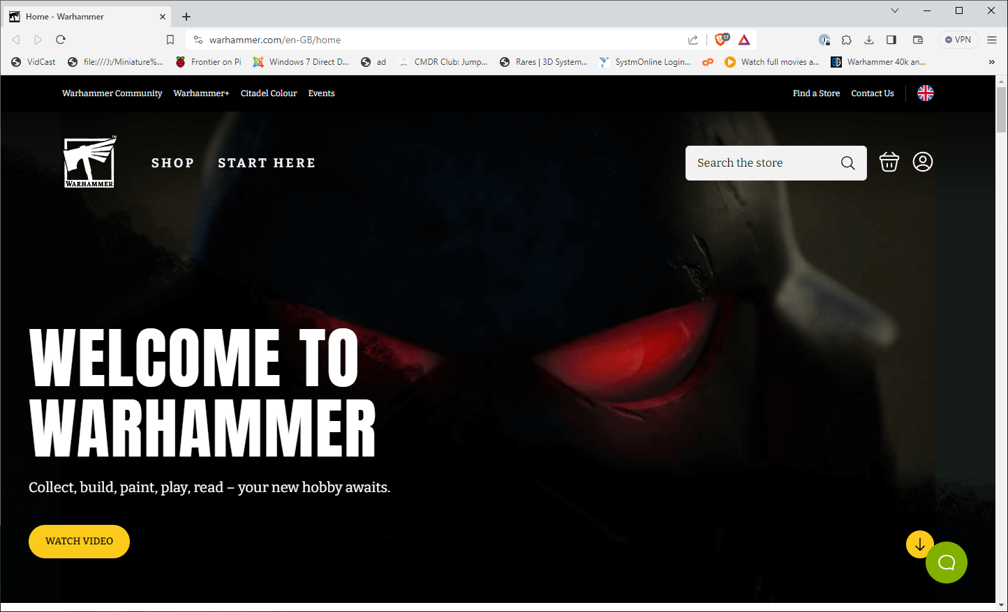
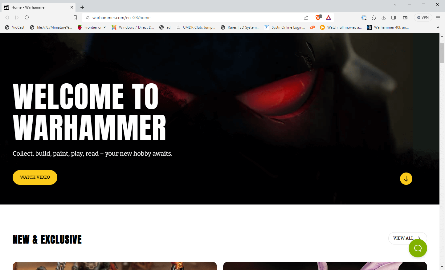 The top header contains links to other GW websites, a link to “Shop”, “Start Here” and a small search bar. The header isn’t fixed to the window, so as you start to scroll down the screen it vanishes, meaning you have to scroll all the way back to click on those key navigational elements. The text of the links is also weird, “Start Here” doesn’t allow you to start buying products and instead takes you to a page with the same top imagery as the home page (meaning you don’t think you’ve clicked anything) and explaining in pretty basic terms how you buy miniatures, paint them and game with them. I would hazard that a very high portion of people already know what Warhammer is, so what is the point of having this as your “Start Here” page?
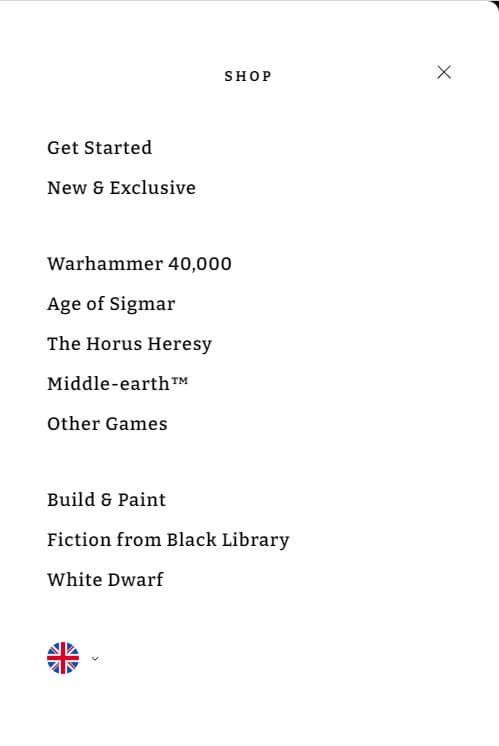
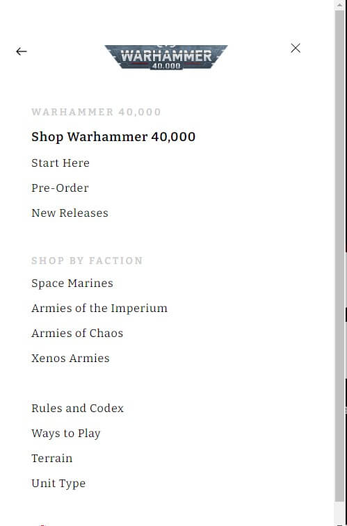 The “Shop” link despite looking identical to “Start Here” has a completely different function and brings up a side menu bar. This is pretty much the only clickable navigation throughout the entire site and it has to be clicked each time – at no point is it docked to the side of your browser. You’ve links to “Get Started” (which is the same as the “Start Here” page), each of the main game systems and then White Dwarf & Black Library. Clicking on a game system brings up a second menu within the same area with a back arrow to go back to the original menu. It’s not that clear if I’m honest and there are better menus out there to achieve a better result. The menu options themselves are a bit of mishmash because they’ve focused on game systems not universes. This means Warhammer 40,000 doesn’t contain Necromunda or Kill Team, Age of Sigmar doesn’t contain Underworlds or Warcry and Horus Heresy is only 28mm Age of Darkness. There is absolutely no reason I can foresee why it’s not universe based with links to the smaller ranges both under the universe and the other games option.
Clicking on any of those specific ranges will bring up the category listing. I will say it looks very pretty with each product having a large box with picture, name, price and option to add to basket. One improvement is that rather than little icons you have text for “online only” and “out of stock”. What has been added to this page is that the boxes scale up with larger screen sizes, so rather than seeing more products you see the same but bigger? I have a 34″ Ultrawide monitor on my computer at home, to say it’s massive is an understatement, if I make my browser fill the screen I can only see eight products in the listing (and 4 are slightly cropped off). It’s a weird decision to have made because you want customers to see more products because it will encourage them to buy.
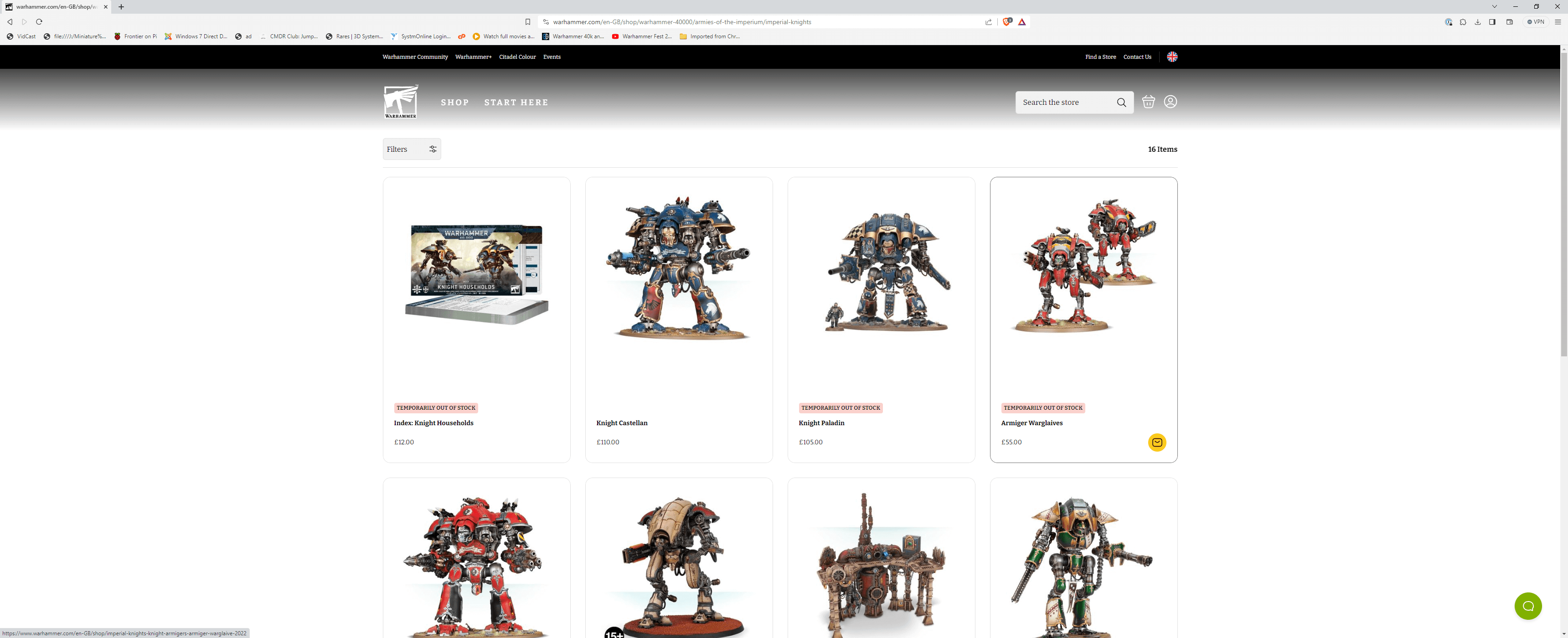
 Equally weird is rather than having a traditional pagination element at the bottom there is a “Show More” button, it’s completely inappropriate as a navigational mechanism on a store where you may have 300+ items in the results.
The order of products is also odd, going to the Imperial Knight section shows a load of out of stock items at the top where it is a more common practice is to move them lower down the listing – those top rows are prime real estate so you don’t want fill it up with stuff that cannot be purchased.
If you want to view a product you have to click on either the product name or the picture – clicking on the box doesn’t actually do anything, despite the border of the box changing with a hover. It’s a basic user experience item that just takes the polish off the site.
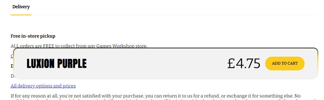
The product page itself is overall quite nice, though the add to basket option is below the page fold for some reason. I love the description with the flourished drop capital. As you scroll further down the page you do have a large and cumbersome add to basket bar which gets in the way.
Below the product description is quite honestly a mess and feels like it wasn’t finished or thought through. You have large boxes with alternative product photos in, though half of them have a servo-skull indicating a missing image (not that this is obvious). I think the intention is that it’s a gallery of photos, but comes over as a mass of random boxes, made worse because this page too has the scale up functionality so you only ever get two images side by side. This is the type of thing you’d see on a clothing store showing customers wearing products – it’s not really suited for this type of website and effectively cuts of the related products bar. It’s also not needed as you have the alternative images available in boxes down the side of the main image.
Adding something to your basket pops up a little basket panel where you can change a quantity for a few seconds, however when it closes or go to another page the tiny basket icon next to the search bar doesn’t change to highlight you’ve items in your basket. Again another very weird decision when the basket is the central component of any ecommerce store. This is compounded because as previously mentioned, the header (where the basket icon lives) vanishes off the screen as you scroll. Considering the previous iteration of the webstore had the basket permanently present at the bottom of the screen, this is a step backwards in functionality.

The basket view and checkout are actually pretty good, there isn’t anything ground breaking but I would be confident in it passing my affectionately titled “Gran Test” where somebody in their 70’s/80’s could place an order. Having a guest checkout option is also a welcome change as many companies force you to sign up.
In Summary
It would be wrong of me to not highlight that the website did work for me without bugs and errors. You can find products, add them to your basket and place an order with a number of payment methods. Broadly speaking it ticks the boxes of being an ecommerce platform.
That said, the new store is a step backwards in terms of functionality when you compare it to the previous version and it feels like quite often that the creators have put form over function. Poor navigational elements make the site difficult to find your way around and the primary function of the site (that of selling toy soldiers) seems to have been missed at points with missed opportunities to show more products and make suggestions.
The choice of things like moving the game systems into a popup menu, not having a fixed header and categories only showing 8 products on the screen (amongst others) would be fine if the site only had a couple of hundred products, however it doesn’t – there are 300+ in the paint category alone which means it feels like the site isn’t suited to the product range that’s being sold.
There is always a challenge to cater for both experienced, long in the tooth hobbyists and people buying gifts for friends or family. The new site certainly feels friendly and less clunky in some areas of operation, but the navigation lets it down, we could have had a really nice store front page listing all the game systems to make it super easy to locate what you were after instead of the current side menu.
Now I do have to say that performance of the site does seem better, which to my mind suggests the engine under the bonnet runs a lot more optimally than the previous one – this in theory should mean the site is less susceptible to crashes during busy periods and there is certainly a queueing system in place which I hope is automated based on load. How easy it is to find the product you want and buy it is an entirely different question though and will be interesting to see how things work with pre-orders this coming weekend.
Broadly speaking I’m a bit disappointed. As a web dev & hobbyist, I just feel it could have been better on so many angles and there’s choices that have been made that result in a poor user experience in too many areas. Certainly principals set out in books like Don’t Make Me Think haven’t been followed and that’s contributed towards the community being actively hostile towards the changes rather than liking them and don’t get me wrong, there are changes that I do like.
So there you have it, my professional view with a few thoughts on how I’d have tackled things differently. I’d be very interested to hear your thoughts.
Thanks! I know exactly what you mean too. It’s really weird when a website upgrade actively reduces the experience and functionality!
You’re right on the money with your review. I actually preferred the older version of the website, I find the new site ‘obtuse’ to use if I can call it that.